| Reviews Archive |
| |
Bram Stoker's Dracula |
| |
|
| |
Graphics |
| |
|
|
|
| |
|
|
Master System |
NES |
| |
|
|
|
| |
|
|
 |
 |
| |
| |
|
|
|
| |
|
|
 |
| |
| |
|
|
|
| |
|
|
 |
| |
| |
|
|
|
| |
|
|
 |
| |
| |
|
|
|
| |
Detail |
| |
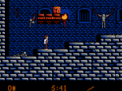
Master System - The detail level here is nothing outstanding, but is respectable nonetheless. The majority of the sprites, and enemies look pretty good, and the backgrounds have well shaded brickwork, stones and ground. Little elements and items litter the stages, such as tables, and paintings, and there's even some gory elements (such as hanging skeletons, blood, bodies on spikes etc) to fit in with the game's horror theme.
Most of the game here takes place in a variety of different castles around the world, with only a few stages taking place outside. Whilst each castle is different, and fairly distinctive I think the game could've done with more environment variety.
NES - The game looks kind of similar to the SMS version, but everything has been a little downgraded, the sprites look worse (the player sprite looks a little unnatural for example), the textures definitely look a bit grittier overall, and some other elements tend to look a little bit unpolished at times.
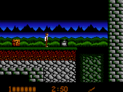
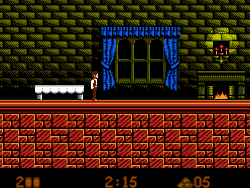
Running through some of the noticeable omissions; the bodies on spikes are absent from the outside stage (see screenshot 2), as well as gravestones and crosses, and some paintings are missing from the castles, as well as little items like vases, and clocks which once stood on the tables (see screenshot 3).
Outside of that, in the SMS game some objects used to be in the foreground (your player would run behind them), this doesn't happen in the NES game (everything is always in the background), the screen doesn't shake after a boss has been defeated, and many items have noticeable black borders around them (see lamp in screenshot 2), which looks unpolished.
At first I thought this version missing some background elements was due to censorship, but later on in the game you find that most of the gore, and blood of the SMS game is actually here intact, so I'm not so sure, I do however think that the graveyard missing all of its crosses is most likely due to Nintendo's stringent policies against religious symbols. |
| |
| |
Winner Is: Master System |
| |
-------------------------------------------------------------------------------------------------------------- |
| |
Colour |
| |
Master System - Colour use is fairly good, but I'd say its not without its issues.
The sprites all look very nice overall, they're well coloured and nicely shaded, but the backgrounds can be a bit inconsistent at times. Sometimes the backgrounds can have well judged, fairly restrained colouring, whilst other times they can look a little over the top, and garish (there's some bright green castles for instance).
Overall its very respectable, but I've seen the SMS do much better.
NES - The sprites here all look significantly worse than those of the Master System version, all the characters just look very low colour, and often seem a little unfinished looking, with a preponderance of white (see sprite picture).
The backgrounds look quite washed out in comparison to the SMS game, and often look low colour. The odd colour choices for some of the castles still remain, so I wouldn't say this version really has any pro's against the SMS game. |
| |
| |
Winner Is: Master System |
| |
-------------------------------------------------------------------------------------------------------------- |
| |
Animation |
| |
Master System - The animation here is actually pretty good all in all, the player and enemies all run and move about with lots of frames of animation, and all look quite fluid in motion (Though I do dislike the jumping animation somewhat).
The stages keep background animation fairly low, but there are some nice elements here and there, such as flaming torches, lava, and water animations, all of which look pretty professional.
NES - All of the sprites here look decent, but I'd say that they look a little cruder in motion than they did in the SMS version. Outside of that the torches, water, and lava animations all definitely look worse, having fewer frames. |
| |
| |
Winner Is: Master System |
| |
-------------------------------------------------------------------------------------------------------------- |
| |
Scrolling |
| |
Master System - The scrolling is pretty much perfect.
NES - The same as the SMS version. |
| |
| |
Winner Is: Draw |
| |
|
| |
Sound |
| |
|
| |
Music |
| |
Master System - All the music in this was actually done by renowned musician Jeroen Tel (known for his work in the C64 Cybernoid games), but to be honest I'm not that keen on the soundtrack. I tend to think that he was trying to do something different with the music, but it comes across to me as being a bit messy and unfocussed at times (though don't get me wrong, it does have its good points, and technically this is some of the more impressive stuff done with the chip).
So, overall the whole soundtrack is very technically impressive, but the compositions are a little inconsistent, some are pretty good, whilst others (such as the music for stages 2, and 4) can be a bit of a cacophony at times.
NES - This is very similar to the Master System in overall quality, but some of the tunes sound a little richer (there's some noticeable arpeggio's in some places), and one or two of them (such as the end of level tune) are definitely higher quality.
Overall not a hugely decisive victory, but I'd say this is definitely a little better. |
| |
| |
Winner Is: NES |
| |
-------------------------------------------------------------------------------------------------------------- |
| |
Sound FX |
| |
Master System - The sound effects here aren't that notable, but they get the job done.
NES - Overall I would say the sound effects are a little worse here. The sounds for jumping, and stamping are very comparable to the SMS version (ie a little bit poor), but I would say the sound effects for collecting items, and hitting checkpoints are much harsher, and more grating than they were before. The tallying up of the score at the end of each level also sounds a bit crude to me. On the upside the knife slashing sound effect I think is a little bit better. |
| |
| |
Winner Is: Master System. |
| |
|
| Gameplay |
Master System - Dracula is generally just your staple platform game, it has you navigating moving platforms, attacking enemies with a knife, picking up projectile weapons such as rocks, axes, and torches by hitting item blocks, and taking down bosses which are based on the various incarnations of Dracula.
The gameplay is a pretty good representation of its genre, its polished, and has some good level layouts which include lots of secret paths leading to rooms filled with extra lives, and credits, all of which are fun to discover. Van Helsing is also hidden in all of the levels, finding him will allow you to use a powered up weapon for that level's boss fight.
The game has three difficulty levels, all each level does is add more stages to the game (in essence you have to play the game on hard mode to be able to play through all the levels).
NES - All of the layouts and gameplay elements are pretty much the same here as they were in the SMS version, but for some reason this has gone through a big difficulty increase.
Firstly this version starts you off in each level with one less hit-point (in the SMS game you took 1/2 damage), secondly you get less time to complete each stage, thirdly many of the boss fights are a little more erratic here than usual, and some are missing their visual cues (for example the first level boss on the SMS usual smokes to show you where he's going to attack from) and lastly this version has had a big increase in the numbers of ghost enemies (an enemy who fades in suddenly when you get close to it). The new ghost enemies have been purposefully placed throughout the stages in inappropriate places to increase the difficulty, often they'll appear whilst you're in mid-air on a platform you've already committed to jumping to, or along a straight run only a couple of feet in front of you. As a result of the changes you tend to take a lot more cheap hits in this version, as such the frustration factor has gone through a big increase.
Outside of the difficulty changes there are some other minor annoyances. This version does not automatically swap to the knife weapon when you get close to an object, so if you've picked up a projectile weapon here you have to repeatedly duck to free items from blocks (instead of being able to just run forwards hitting them as usual like you could in the SMS game, which was much faster). The controls I feel are also a little less responsive here all in all. |
| Winner Is: Master System |
| |
| Presentation |
Master System - There's not really a lot to talk about to be honest, this version has a sample at the beginning which says "Dracula", but outside of that I didn't really notice anything all that notable.
NES - Same as the SMS game, but the "Dracula" sample seems to be absent. |
| Winner Is: Master System |
|
| |
| |
Conclusion |
| |
This has been a pretty straightforward comparison all in all, the SMS version is better, and outside of the slightly weaker music there aren't really any tradeoffs so to speak. The SMS game simply plays a lot better, and has better graphics. |
| |
Overall Winner Is: Master System |
| -------------------------------------------------------------------------------------------------------------- |
|
| |
|
|
|
|