| Reviews Archive |
Shinobi |
|
|
|
| Graphics |
| |
|
|
|
|
Master System |
|
|
|
 |
| -------------------------------------------------------------------------------------------------------------------------- |
| NES |
|
|
|
|
| -------------------------------------------------------------------------------------------------------------------------- |
| C64 |
|
 |
 |
 |
| -------------------------------------------------------------------------------------------------------------------------- |
| Amstrad |
|
 |
 |
 |
| -------------------------------------------------------------------------------------------------------------------------- |
| Spectrum |
|
|
|
|
| |
|
|
|
|
| Detail |
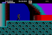
Master System - The graphics here are fairly representative of the then impressive arcade game, but the sprites are very small here by comparison, the levels are zoomed out, and some of the little details are missing, such as posters, railings, and fences.
Texturing is inconsistent, some of it looks comparable to the arcade original (as good as you'd expect under the circumstances), whilst other sections look quite simple and a little rushed (see floor texturing in screenshot 3 and 4).
NES - This NES version is actually a direct port of the MS game, so the graphics tend to be very similar to that version, however, as you walk though the stages some downgrades become apparent, little things from the Master System version such as door handles are missing, and the windows aren't drawn as well as they were before etc. Texturing also takes a bit of a hit, with many sections, and elements looking worse (see untextured buildings in screenshot 2).
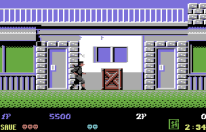
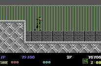
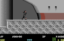
C64 - In regards to the foreground the resolution here is noticeably lower than the console ports, but I have to say that the coders seem to have really gone the extra mile here. Even with the low resolution they've managed to squeeze in many little elements and details, there's more defined brickwork than the console versions, cracks in the walls, hand rails and fences, and a lot of shading.
The texturing here is first rate (see screenshot 3), and is easily the best out of the 3rd generation ports in this area, the programmers have even used a lot of dithering to get some more colours and shades out of the system. Unfortunately the upper level background is pretty much nonexistent here, but with the foreground looking as good as it does, and often obscuring the far background this isn't as much of an issue as it sounds.
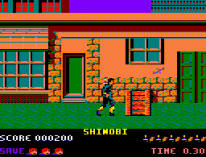
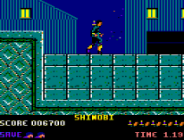
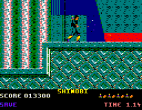
Amstrad - This is also very low resolution compared to the console ports, in fact it appears to look lower resolution than the C64 version too. Outside of the resolution though its not that bad, like the C64 version the developer here has also tried his best to add little details like brickwork, cracks, window frames, and shading. There's no hand rails or fences, but unlike the C64 version this includes the upper level backgrounds.
The textures here are generally quite good (though blocky), but every now and then there'll be an object which looks below par (see boat on screenshot 3 for example).
I'd say overall this version actually manages to be more detailed, and better textured than the console ports (though low resolution), but worse overall than the C64 port.
Spectrum - This version is higher resolution (like the console ports) and very detailed, you've got most of the elements seen in the other computer ports such as the detailed brickwork and such, but there's also more added here such as window reflections and more complex texturing, the player and enemy sprites are also more detailed, and the bonus level looks impressive.
On the bad side though, some of the elements here might be more detailed. but they are often drawn poorer, the player sprite for instance is probably the most detailed of these ports, but its not actually drawn that well in the first place, and looks a little like a hunchback, other sections look a little shoddy and unfinished (see boat in screen shot 3).
Overall I've decided to give the detail section to the C64, because its more consistent throughout the game. |
| Winner Is: C64 |
| -------------------------------------------------------------------------------------------------------------------------- |
| Colour |
Master System - Its a decent job overall, but also suffers from being a bit on the inconsistent side. Some of the levels reflect the colours of the arcade games fairly well (albeit with a more cartoony and less realistic pallet), but others use some very odd and inaccurate colouring that looks a little ugly, Mission 2 (see screenshot 2) for example uses turquoise for the ground, and purple for the buildings in the background, and Mission 3 uses red plants, a turquoise wall, and purple mountains.
I don't want to come across too negative though, as overall its still pretty decent, but to be honest you'd expect a lot more from the Master System than this as the system had very good colour capabilities for its time.
NES - Take the Master System version and make all the colour choices a little worse and you pretty much have the NES version (see pink building in Screenshot 2, and boat in Screenshot 3). Some of the textures which used many colours in the MS version (such as the floor texture in screenshot 1) now use only one colour with black texturing.
C64 - This is actually pretty good, the colour choices are much more realistic and better suited (not going overboard like the console and Amstrad ports), and as mentioned earlier there's some good dithering use, increasing the appearance of onscreen colours (see screenshot 3). Definitely a very admirable job for the Commodore.
Amstrad - This is just too over the top in my opinion (too much bright orange!). This port is generally pretty garish, but at least you can see what you're doing, and colour counts are quite high. I do have to mention that some levels tend to look better than others though, Mission 2 has some respectable colour use which doesn't go too far for instance.
Spectrum - For the most part this is just really, really ugly. Poor colour choices take place throughout the game (loads of green and yellow), and there's tons of clash (including background on background clash which isn't usually that common). In this instance the colour clash does actually effect the gameplay too (more on that later). |
| Winner Is: C64 |
| -------------------------------------------------------------------------------------------------------------------------- |
| Animation |
Master System - Pretty well animated with a respectable amount of frames, well drawn.
NES - Its decent, though definitely inferior to the Master System. I think the actual amount of frames is similar but the movement doesn't look as natural, and only small elements change between the frames, with most of the sprite staying the same (if you look at the crawling animation only the legs are moving, whilst on SMS the arms and legs are animated).
C64 - Another good job overall. The enemies here actually have more frames of animation than those in the Master System, but this version isn't drawn quite as well (the low resolution makes it harder to animate well), with some actions such as the crawling looking less natural here than the SMS version.
Amstrad - Uses a very respectable number of frames (I think maybe more than the SMS version even) but they aren't actually drawn very well and the movement looks a little odd in motion, still a good enough job though.
Spectrum - Not great, but it gets the job done, this version uses a decent amount of frames but the movement isn't very good, with the sprites shuffling forwards in an awkward looking fashion. |
| Winner Is: Master System |
| -------------------------------------------------------------------------------------------------------------------------- |
| Scrolling |
Master System - The horizontal scrolling is smooth, but unlike the arcade original there's no vertical scrolling unless you use high jump, at which point you get a very rigid and slightly less smooth scroll.
NES - Smooth horizontal scrolling, but this version doesn't actually scroll vertically at all (even when using the high jump).
C64 - Smooth horizontal and vertical scrolling at all times
Amstrad - This version's scrolling just about scrapes into the "decent" area. It has choppy scrolling, and a low frame rate (~12.5fps, 4 pixel steps), but like the C64 version (and unlike the console ports) it does manage to retain the arcade's vertical scrolling. Unlike some Amstrad games the scrolling and frame rate here are good enough that they don't have a detrimental effect on the gameplay, after a while you get used to it and it becomes fairly unnoticeable .
Spectrum - The horizontal scrolling isn't that smooth, but its alright (better than Amstrad). This version also doesn't scroll vertically unless you do a high jump. |
| Winner Is: C64 |
|
|
| Sound |
| |
| Music |
Master System - Unfortunately only a handful of the arcade music tracks made it over. There seems to be only three music tracks used for the whole game, one for all the levels, one for the bonus rounds, and one for the boss fights.
The levels all use the arcade Stage 2 music, the boss music is present and correct, but the bonus round music uses arcade Stage 1 music instead of the actual bonus stage track. The quality of what's there is very respectable, but the repetitive nature of the soundtrack does grate a little after prolonged periods of time.
NES - This follows the limited music of the SMS version (ie only three tracks), its not a very good use of the NES sound chip either and definitely sounds inferior to the Master System version. Another point worth bringing up is that in this version the sound effects actually cause elements of the music to cut out.
C64 - This version has no in-game music at all, which is an odd decision for the C64, and unfortunately its omission definitely hurts the overall experience somewhat.
Amstrad - Very good music (128k models only unfortunately). All of the arcade's music seems to have been retained, and the order is also correct, with the original music being used for the same levels. The actual quality of the music is also good, and everything is recognisable. Definitely an excellent job overall.
Spectrum - Like the Amstrad this version has loads of different tracks which seem to be used in all the correct areas. The sound here is more layered than the Amstrad version, sounding more complex, but is a little too high pitched in my opinion. This and the Amstrad version are most definitely well and trully in the lead in the music criteria.
Out of the two versions I've decided to go with the Amstrad version, its simpler than the Spectrum version's sound, but recreates the deeper, rhythmic beat of the original a little bit better overall in my opinion. |
| Winner Is: Amstrad |
| -------------------------------------------------------------------------------------------------------------------------- |
| Sound FX |
Master System - Good sound effects for the most part, there's some odd sound effects here and there but nothing notable enough to be worth mentioning. The voice samples from the arcade are all missing though.
NES - This version has pretty poor sound effects which sound a bit on the ridiculous side, only the Spectrum version has worse sound effects overall. Voice samples are also missing here.
C64 - Very good sound effects, no voice samples.
Amstrad - The sound effects are pretty respectable, they do the job pretty well. This is the only version which recreates the original arcade game's voice samples, with the mission level and completion announced at the start and end of each level.
Spectrum - The beeper is used for sound effects, they're not really very good but they just about do the job. |
| Winner Is: Amstrad |
| -------------------------------------------------------------------------------------------------------------------------- |
| Gameplay |
Shinobi was a arcade game much in the style of Namco's earlier Rolling Thunder, you move through the stages throwing projectiles at the enemies, and are required to rescue a set number of hostages, most of the stages also contain two planes of movement to navigate. Its a very tense action orientated game which requires careful timing and precision, mainly due to the fact that it follows a one hit kill formula, this element forces you to concentrate, be careful, and tackle each enemy as efficiently as possible. Offsetting the brutal one hit kills is some very responsive control, and a decent number of different moves, on top of the aforementioned projectiles you get a very useful and strong melee attack which makes short work of close range enemies, a crawl which lets you duck under enemy attacks, and power-ups that give you a gun and sword.
Master System - For better or worse many elements of the gameplay of this version have been drastically changed, and as a whole this version no longer resembles the original arcade game that much.
Firstly the game no longer uses one hit kills, it gives you a decently lengthy energy bar, this means that careful movement and precision is no longer much of a requirement, you can blunder through the stages walking forwards and shooting (as opposed to being forced to move between planes to get close to troublesome enemy placements, a common occurrence in the arcade original). The character here has also been weakened, your movement is much slower than before, and whenever you fire there's a longer pause than usual, initially you can only throw one projectile onscreen at a time, but this improves with the acquirement of power-ups (more on this later). In this version saving the hostages is no longer a requirement, you can walk in a straight line from the start of the level to the finish.
On the more positive side are some new inclusions, there are some new magic abilities (such as flight), and whilst the hostages are no longer required, if you do rescue them you receive power-ups which last until you run out of health, these range from new melee weapons (chain, and nunchaku, on top of the original sword power-up), new projectiles (knives and bombs on top of the original gun power-up) and health bonuses which fill or even increase your health bar.
The new inclusions are nice, but don't affect gameplay as much as you'd think, to receive the magic in this version you have to successfully complete a bonus stage, and the bonus stages are so much harder here that this becomes a rare occurrence. Many of the weapon upgrades simply feel like sprite changes of each other and some (such as the knife) are only giving you back the arcade's natural throwing speed after weakening you initially, the bombs are quite cool to use, they either travel in an arc, or can be rolled along the ground (very useful) but sometimes they can be ill suited to some of the level layouts. The fact that you lose all your power-ups when you die also creates some problems, die just before the Mission 3 boss and you'll be fighting it in a much weaker state than is normal as your throwing speed is much slower. Still, this version plays very well overall, and is probably the more accessible version due to its new energy bar.
NES - As mentioned earlier this version is a direct port of the SMS version so everything written for that applies here too.
On top of what was written earlier, unlike the Master System version the NES version does not scroll vertically at all, so the levels had to be redesigned to fit to the height of one screen, this simplifies a lot of the layouts and makes the levels feel much smaller. The bigger issue with this though, is that some of the stages were actually vertically orientated originally (Mission 2 Stage 2, and Mission 3 Stage 2 for instance), with you climbing up the levels or descending down them, being that this version doesn't vertically scroll, these levels have been completely redesigned as (uninspired) horizontal levels.
The second major issue with this version is that its missing the plane movement! you can freely use the normal jump to travel from platform to platform, and enemies on different planes which would usually not be able to hit you can now do damage, not only that but there's also no enemy pause after you do a high jump, so here you will often high jump only to land on an enemy bullet.
Generally the NES game feels a little bit buggy and unfinished across the board, it just doesn't feel very polished, its the little things such as the fact that you can now use the high jump at any time you want, allowing you to shoot up to the top of the screen at a moments notice, or niggling problems such as the fact that the momentary invincibility after taking a hit is now gone, so sometimes you'll end up bouncing back and forth taking unfair damage. Overall a poor showing for NES Shinobi.
C64 - This version is much closer to the original arcade game than both console versions, and recreates the fast pacing and action of the original arcade game well.
The only issue here (and unfortunately its a pretty noticeable one) is that the frequency of enemy respawns is much too high, there are just too many fast enemies rushing you at all times, making this version harder than the arcade game (which wasn't particularly easy itself in the first place). The only other thing I noticed, is that the Spider-Men who cling to the walls of some stages are completely absent here.
Amstrad - Again, like the C64 version we have a much more accurate playing experience here, the feel of the arcade game has been retained, its as action packed as ever, and the controls and player movement are fast and responsive.
In this version there is no wait times between shuriken throws at all, which actually increases the pacing somewhat, and as opposed to the harder C64 version, in my opinion this one is actually a bit easier than the arcade version. The Spider-Men who were absent from the C64 version are included here just as they should be, but most lamentably the final boss is actually missing! the game ends with you finishing off one last mildly problematic grunt and that's it.
Even with the lack of a final boss (which I concede is an extremely big issue) I still have to give credit to this version in the gameplay section, its the only 8-bit port which manages to re-create the feel of the arcade game properly in a way which is fun to play (the C64 version comes close, but in the end is just a little too frustrating). After careful thought I've just decided that I'd rather play a game which is great right up until the end (Amstrad), than one which is more complete, but plays a little inferior for the bulk of the experience (C64).
Spectrum - This also follows the arcade version, but doesn't do quite as good a job in the gameplay stakes as the other computer ports, and Master System version. Firstly the screen is zoomed in close to the character, good for giving you a nice sized sprite, but not good for finding the hostages, as you can no longer see the higher plane at all until you switch, this change means that missing hostages and having to backtrack is a much more common occurrence here.
Due to the developers not being careful with their colour choices it can be difficult to see the bullets and some of the enemies (primarily the Spider-Men) in this version, you'll be walking along and you'll suddenly die without seeing what's killed you until its too late. Other problems which have a detrimental affect on the gameplay are the omission of the melee attack, less responsive controls overall, and the fact that you take damage when touching or landing on enemies (usually you only die if struck with a weapon). In the end it still plays decently, but doesn't really compete in the same level as the other versions. |
| Winner is: Amstrad |
| ------------------------------------------------------------------------------------------------------------------------- |
| Presentation |
All versions are missing the boss appearances prior to the main fight (in the arcade version the boss would make a quick appearance at the end of some stages to taunt you)
Master System - There's a title screen where Joe's eyes move around, and a map screen appearing at the beginning of each mission that also shows that particular mission's target (the boss).
NES - Unlike the SMS version, Joe's eyes don't move around during the NES title screen, the map screen is still here.
C64 - No title screen, no maps between levels.
Amstrad - There's a title screen, but its a bit bland, no maps at the beginning of new missions.
Spectrum - No Title screen, no level introduction, no map screen |
| Winner is: Master System. |
| |
| Conclusion |
This is going to be an unusual outcome for once as both the console ports actually took themselves out of the running before the competition really even began. The Master System version changed so many gameplay elements that it doesn't really play that much like Shinobi anymore, make no mistake though, I'm not automatically disqualifying it simply for being inaccurate, sometimes changes to a game can be for the better, but in this case I have to say that I feel that whilst the changes to this version resulted in a more accessible game, they also removed much of the personality of the original, creating a game which is still very good, but not quite as notable, no longer a "classic" of its era so to speak, the grace and speed of the original game is sadly absent now.
The NES version is a bit of a mess truth be told, take the Master System version and make everything worse and you have the NES version, the gameplay has been compromised in many different aspects, the sound is worse, and the graphics and animation are worse too. Effectively this feels like it was released in an unfinished state, its just very unpolished.
The Spectrum version tries to be more accurate, but has issues with the gameplay, and is extremely ugly. Overall, accurate or not the Master System version is the better game in this instance.
That just leaves us with two contenders, the C64 and the Amstrad versions, and truth be told neither of them really does the arcade game justice. The Amstrad version has very ugly graphics, whilst the C64 version has very poor sound, the Amstrad version is a little too easy, whilst the C64 version is a little too hard. Overall I find it difficult to choose a winner between these two, but I think I'm going to go with the Amstrad version, as whilst fairly ugly, it manages to juggle all the elements of the game respectably as a whole, and has a better difficulty curve than the C64 version. Whilst mildly disappointed with the ports (especially the console ones), I must admit that the Amstrad's programmer has done a phenomenal job with its version, the hardware really isn't that well suited to this kind of arcade game in the first place, and yet the game runs at a very respectable speed and still contains the impressive boss fights too, this is definitely one of the best examples of an action game on the Amstrad that I've played so far. |
| Overall winner is: Amstrad |
| -------------------------------------------------------------------------------------------------------------------------- |
|
| |
|
|
|
|