Bionic Commando |
||||
Graphics |
||||
 |
||||
 |
||||
 |
||||
Detail
|
||||
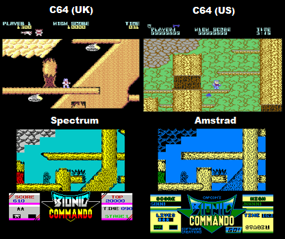
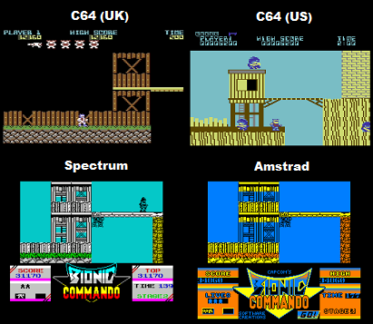
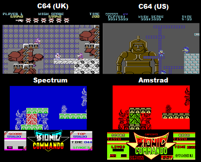
C64 (UK) - This version's graphics and level layouts are the closest to the arcade version. For the most part detail is fairly good, though sometimes the repeating background textures can appear a little shoddy (see the wall textures in the third screenshot along). Unfortunately the main player sprite doesn't look as good as it could've (as can be seen by comparing it with US version's C64 sprite, which looks more like a man wearing shades and less like a robot). C64 (US) - Though it looks a little basic overall the graphics are still functional. The main points to bring up here are that the textures are cruder than those in the UK C64 version, occasionally the background graphics can look a bit sparse, and some of the objects in the the levels are undersized (just check out that tiny bee hive in the 1st screenshot). Spectrum - The detail level here is not really very noteworthy, and I've definitely seen the Spectrum do much better than this. There's not much going on with the backgrounds, the textures are a little low quality in comparison to the C64 (UK) version, everything is a little scaled down, and there seems to be something wrong with many of the sprites (more on this later). Overall it's probably still a bit better in detail than the US C64 version though (looking at the second picture along for example, the buildings and floor textures on Spectrum look to have had a lot more work done on them, showing layers of rocks, and grass, as well as detailed brickwork, and more windows). Amstrad - As is evident from the screen shots above, the Amstrad version of Bionic Commando is a direct port of the Spectrum version, and as such has the exact same level of detail (ie nothing special detail wise) |
||||
Winner is: C64 (UK)
|
||||
Colour |
||||
C64 (UK) - The use of colour is quite well done for every level in the game, everything is realistically coloured, good job. C64 (US) - The colour use isn't bad, I would say it's quite a way off from being as good as the UK version of the game though as the colour use is quite a bit simpler, isn't as well chosen, and creates a less distinct art design overall. When taking into account both colour, and detail the overall graphics here are superior to the Spectrum version. Spectrum - The colour use is half alright (for Spectrum this is actually fairly good) its a little bit over the top, garish and unrealistic (bright yellow trees, turquose sky etc) but it just about does the job. Colour clash is very much evident, but it doesn't have a harmful effect on gameplay as bullets are pretty easy to see. Amstrad - The colour of this version is truly atrocious, to be honest, it appears as if no effort has been made to make the game look even half decent. Everything here is appallingly garish, and often unrealistically coloured (added to the Spectrum version's bright yellow trees we now also have bright orange grass?!). The status bar at the bottom of the screen is different for every level, but no matter what level you're on it manages to look awful. All of this is a little unacceptable for the Amstrad to be honest, the Spectrum has an excuse for its yellow trees (nothing even remotely brown in the hardware's pallet), whilst the colour problems with the Amstrad version are all due to it being quickly ported from Spectrum instead of being designed for the Amstrad from the ground up. |
||||
Winner is: C64 (UK) |
||||
Animation
|
||||
C64 (UK) - The animation is pretty good and definitely does the job well, especially noteworthy is the swinging motion which is much better here than in the other versions. C64 (US) - The animation isn't particularly good, it looks half alright when walking but the grappling hook looks poor. Spectrum - Both the walking and grappling animations are adequate, its nothing amazing but not bad by any means. Amstrad - The animation here is the same as the Spectrum version, but slower. |
||||
Winner Is: C64 (UK) |
||||
Scrolling |
||||
C64 (UK) - Generally the scrolling is very good and very smooth, you can occasionally out run the screen, but overall this is a fairly minor criticism. C64 (US) - This version has push scrolling, its definitely better than the Spectrum's scroll but nowhere near the higher quality constant scrolling of the UK C64 port. Spectrum - A bit on the poor side to be honest, a push screen scroll is used in this version and it looks quite choppy in action, it looks a bit ugly, and even occasionally causes problems with the gameplay. Amstrad - The scrolling here is quite poor, exactly the same as the Spectrum version. |
||||
Winner Is: (C64 (UK)
|
||||
Sound |
||||
Music |
||||
C64 (UK) - Firstly, admirably all the music from the arcade is present (a different track for every stage). The music itself is a bit inconsistent though, it starts off poor with the opening menu music (a cacaphony) and the first stage music (grating on the ears), but improves more and more as the game goes on. One of the big highlights is level four's music which includes some pretty impressive use of the C64's sound chip. C64 (US) - There only seems to be one tune used, the arcade's first stage music (a tune that I personally feel is one of the weakest in the game) this song plays throughout the whole game, it's not particularly well composed in this instance either unfortunately. Spectrum - Fantastic quality for Spectrum music, this is easily some of the best use of it's sound chip in existence, its very catchy, memorable, and complex. It doesn't hit the heights of the C64's music, but unlike that version all the tracks here are consistently high quality. The only unfortunate thing here is that one of the arcade tracks is missing (level four) this level re-uses level five's music. Due to the missing track I'm finding it difficult to judge a winner in the music criteria, so I'm going to go with a draw, because whilst the Spectrum has fewer tracks, what it does have are less intrusive than some of the lessor C64 tracks, in soundtrack the C64 version's high's are much higher than the Spectrum, but its lows are also much lower in my opinion. Amstrad - The great music from the Spectrum version was completely dropped from this port, there is no in-game music at all. |
||||
Winner Is: Draw between C64 (UK) and Spectrum |
||||
Sound FX |
||||
C64 (UK) - This version has no in-game sound effects. C64 (US) - There's not much going on sound effects wise, most of them are adequate, though some are ill fitting, the grappling hook sound effect for instance sounds a little bit ridiculous here. Spectrum - The Sound effects are alright but very basic, the gun sounds decent, the grappling arm sounds metallic, and generally its all pretty solid for the old Spectrum beeper really. Seeing as this section is offering up no real competition I'm actually calling a win for the beeper! Amstrad - Even the sound effects manage to be worse than the Spectrum beeper, which is rarely the case, the grappling hook even sounds a little bit Atari 2600 to me. The only good sound effect used in my opinion is the one for explosions. |
||||
Winner Is: Spectrum
|
||||
Gameplay |
||||
Bionic Commando is a five level arcade platforming game. Its main selling point at the time was that instead of including the traditional jump button, it gave the player a bionic arm and the ability to grapple onto platforms and swing around the stages. Much of the gameplay consists of shooting the enemies and using the bionic arm to climb up the vertically orientated levels and swing over hazards. Due to the removal of the ability to jump the game really emphasizes quick thinking and forward planning as you always need to be thinking of the next place to grapple onto to avoid getting pinned down. Whilst including some clever gameplay ideas, for the most part Bionic Commando is an old arcade quarter muncher, and as such can tend to be a little on the frustrating side at times. C64 (UK) - This version probably plays the most accurately to the original arcade game (mainly due to the closer level layout, and attention to detail). It does play a little slower than it should though and also has some other issues worth mentioning. The biggest of the problems is that this version is a little unresponsive, if an enemy is coming from behind and you try to turn and fire the slowness and lag will usually cause you to walk into them, and the firing itself also tends to be unreliable at times. The second problem is that there are certain missing actions, you can no longer hold a direction whilst swinging to jump gaps for instance, you have to just disengage the grapple at the right time instead. To compensate this missing action the developers added in a little jump to the character when you disengage the grapple, but unfortunately because of this, when you need to quickly disengage to avoid an enemy the little jump will sometimes send you careening into them instead. The unresponsive controls are a problem for the game as they offset the usefulness of the new grappling move, and when added to the game's natural jump omission they give you the feeling of controlling an unwieldy character, in the arcade version it felt more like you were losing one control feature and gaining a new one. Some other minor things worth mentioning are that the enemies are more aggressive in this version, and that the tree branches sometimes break even when you're not actually standing on them. C64 (US) - The US version of Bionic Commando suffers from a plethora of missing elements. The biggest problem here has to be the crude implementation of the grappling arm, in this version it can only be used to pull yourself up vertically or diagonally, there's no swinging motion at all so you can't jump gaps. In comparison to the UK version the controls are more responsive, and you can even direct yourself whilst falling (very helpful), but this game's even more limited moveset, coupled with some new issues (you can't move forwards and fire as this causes you to start grappling instead, you can't fire whilst hanging) makes it overall just as stiff to control as the UK version. This is also very much lacking the attention to detail found in the other versions, for instance some of the hazards are missing such as the gun turrets and giant robots. Both of these elements were recreated pretty well in the UK version but whilst still appearing here, are stationary, and don't actually do anything anymore. Spectrum - Though the level layouts are a little scaled down here compared to the C64 (UK) version, they are still actually fairly accurate (even the robots move properly), for the most part everything is in the right place but is a little bit smaller. This version is by far the fastest and most responsive. The grappling hook works quickly and unlike both C64 versions has a full moveset, but it does suffer a little due to not having as fluid movement as the UK C64 game. Like the other two games there's some problems unique to this version. The push scrolling makes it difficult to forward plan as sometimes you can't see what enemies are coming up, and whilst swinging you are no longer invincible to enemies. The enemies are also very fast in this version to the extent that they can be difficult to react to in time. Apart from these problems the gameplay is pretty fun, though doesn't retain the feel of the arcade version in the same way as the UK C64 game does. Gameplay wise the Spectrum and C64 versions of Bionic Commando are difficult to compare, they both play very differently to each other and are quite on par. Personally I think I'd give the edge in gameplay to the Spectrum (by a hair), due to its responsive controls and faster gameplay. Amstrad - Like most of the games directly ported from Spectrum, Bionic Commando on the Amstrad runs significantly slower than it was originally intended to, the slower speed really hurts the gameplay as movement feels too slow, and lethargic. Enemies arrive and attack at a speed which makes them too easy to deal with and no longer a danger. As a result of the speed differences this version is much more tedious overall. |
||||
Winner is: Spectrum |
||||
Presentation
|
||||
C64 (UK) - No noteworthy extras. C64 (US) - Nothing really worth mentioning. Spectrum - Not really any extras, cut scenes or in game storyline to speak of. Amstrad - The same as the Spectrum version but with different colours. The title screen is truly an abomination to behold. |
||||
Winner is: Draw |
||||
Misc |
||||
Funnily enough, due to a seemingly error with the colour in the spectrum version you don't actually get to see what the main sprite is supposed to look like until the 3rd level, this is what it was meant to look like |
||||
Conclusion |
||||
Firstly the US C64 version is out of the running as its just too slow and is missing too many crucial elements to the gameplay (no swinging, slow grappling, no environmental hazards). Its just not programmed to the same high standards as the UK release. Its music is also far inferior to the other versions. The Amstrad version is nothing more than a watered down port of the Spectrum game. Its missing the Spectrum version's sense of speed and excellent music, and the colour aspect is even worse than before. Comparing the Spectrum and Commodore (UK) versions I would say (probably controversially) that in the area of music and gameplay these two versions are fairly on par with each over, but the C64 versions graphics and scrolling are much better, and as a whole it generally represents the original arcade game more closely than the Spectrum version (which has a very different feel to it), so its a C64 win overall. |
||||
Overall winner is: C64 |
||||