Ys III Detail Examples |
||||
 |
||||
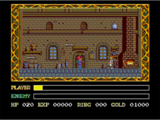
Firstly the TG-CD version. The colour choice is well chosen and the background colour is spot on. The weapon smith himself is also very nicely coloured. There's also a ton of detail in the room, including items on the floor, armour and weapons, an animated fireplace, well drawn window frames and a lot of shelving. |
||||
 |
||||
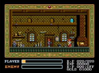
Here's the Mega Drive version. the main colour doesn't fit quite as well as in the TG-CD version, but still looks alright, the weapon smith uses a lot of colours and looks great. The detail level here is even higher than in the TG-CD version, with little items scattered all over the place, the details from the TG-CD such as the shelving, animated fireplace and window frames are retained, and the windows even have little reflective surfaces drawn on them. |
||||
 |
||||
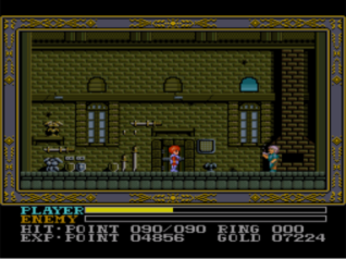
Lastly we have the SNES version, the entire screen has a very drab and washed out look to it, (check out the gold and silver colour of the weapons). The weapon smith is also using far fewer colours than in the other versions. If you look to the feet of the weapon smith you see that there are far fewer objects and details around the floor, look to above his head and you find that the shelving is also gone. The animated fireplace is absent, the window frames aren't as well drawn and the reflective surfaces of the windows are also gone. |
||||