Battle Squadron |
||||
Graphics |
||||
 |
||||
 |
||||
 |
||||
Detail
|
||||
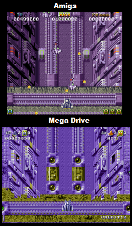
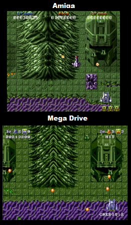
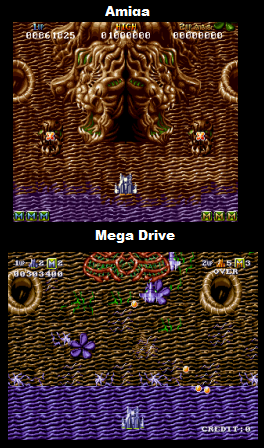
Amiga - The game looks pretty respectable for 1989, but is not really pushing the Amiga and could probably do with some better art design here and there (some sections just don't really look that inspired). Still, all in all it looks decent and is graphically polished for the most part. Shading here is actually pretty good, with most objects well shaded, and having ground shadows and such. Textures are varied, and decently blended, though not particularly memorable in art design. The original European PAL version has a great resolution of 320x256 (though is horizontally bordered), but the US version is a little downgraded (its much shorter than before) and suffers for it. Mega Drive - This version looks inferior across the board. The Mega Drive version has cut out quite a significant number of ground textures from the game. Some environments (such as the space section at the beginning of the game) are completely absent, and most of the other environments are missing details too, with less variety in the tiles that make up each texture (absent pipes and such in Cave 2, fewer cracked or damaged floor sections, fewer plants etc). Some ground elements are noticeably downgraded, with the mountainous areas of the second cave for instance being made up of fewer horizontal strips (screenshot 2), and towers being shorter and having some elements missing (again screenshot 2). Other structures are absent entirely (see screenshot 3). The shading here is noticeably inferior, in fact most of the time its completely absent! If you check the two sides of the overworld's ravine (screenshot 1), you'll notice that each side is shaded independently on Amiga, whilst on the Mega Drive they've just mirrored the graphics to create the other side. All of the towers are also the same way (see screenshot 2). On top of that all ground shadows are absent in the Mega Drive version (again, see the tower in screenshot 2). Due to the lack of shading this version looks a bit flat. Transitions between ground types are cruder here, on Amiga there was more effort to make them blend in with each other, whilst here there's usually just a straight horizontal line between transitions (screenshot 3 is a good example of this, the purple element is blended much better on Amiga) There's also a good few small touches missing, there used to be little cars traveling across the walkways in the second cave of the Amiga version for instance. There are some good points though. The player sprite is a little better shaded for instance (see sprite picture), and there have been one of two new elements added to the parallax layer in cave 2 (lava). |
||||
Winner is: Amiga
|
||||
Colour |
||||
Amiga - Not bad for its year but nothing particularly impressive. The sprites look very low colour across the board here, with the player ship especially looking quite weak, and many of the backgrounds look a little drab overall, but little dashes of colour here and there (such as on gun turrets and ventilation ports etc) help to liven things up a bit. The stages have a pretty respectable amount of colour variety in them, and everything is decently polished, so its ok. The game does a trick to get more colours into the status bar, which improves that area a bit, but is localised to such a small area of the screen that it doesn't really have a huge affect on the graphics. Other than that there are a few nice touches here and there, for instance every time you complete one of the caves, when you get back to the overworld the ground changes colour. Other than that there's a nice enough multi-coloured effect for when you set off smart bombs, and whenever you hit certain enemies (such as gun turrets) the screen flashes from the explosion. Mega Drive - I would say that this is definitely worse than the Amiga original. The overall colour choices make for a slightly more brash, even lower colour look (I'd say the original colours were slightly richer), and the small dashes of colour are often absent, with ventilation ports, gun turrets, bosses, and general technology usually re-using the same drab colours from the environment (see screenshot 1, Mega Drive has no dashes of red and orange). This version also looks grainier, and less well-blended at times where it comes to some of the ground textures. Some of the smaller details worth mentioning are that the status bar doesn't do any tricks to increase colour count, looking much lower colour than the Amiga game, and the overworld no longer changes colour after you've completed one of the levels. I've checked through a lot of the environments here, and even without taking into account the status bar, the Amiga version usually has slightly higher numbers of colours. On the upside the player sprite has been improved. |
||||
Winner is: Amiga |
||||
Animation
|
||||
Amiga - Well, the game is a scrolling shmup so sprites generally slide around the screen as you'd expect, but there's actually some quite nice animations included for many of the larger enemies and bosses. Some of the enemies in the first cavern for instance actually drop and crash into the floor after being destroyed, and the two headed turrets in cavern two spew out fire and burn out. Where the boss fights are concerned you can often see them take damage, with cracks appearing and electricity leaking out. For its genre, and time, I'd say this is actually well animated. Mega Drive - Definitely inferior to the Amiga version. Most of the little touches apparent in the Amiga version are actually absent here, with the generic explosion image being used for the destruction of all enemies (no dropping animation, no burn out animation, worse boss animation etc). |
||||
Winner Is: Amiga |
||||
Scrolling |
||||
Amiga- The game scrolls well both vertically and horizontally. Mega Drive- Pretty much the same as the Amiga, but they've actually added in parallax for some of the stages, sometimes in the foreground, sometimes in the background. |
||||
Winner Is: Mega Drive
|
||||
Sound |
||||
Music |
||||
Amiga - To be honest there's not really that much here to speak of. The main game only has one tune which plays throughout the levels, and one tune used in the intro, that's it. Luckily the main tune if fairly elaborate, and is quite long so its not too repetitive. Both tunes are also pretty catchy and well made, so whilst there's not much here, what there is is good. Mega Drive - The same tunes as the Amiga version, with no extras added in. The music here is of noticeably inferior quality, sounding a little less polished, and more scratchy overall. |
||||
Winner Is: Amiga |
||||
Sound FX |
||||
Amiga - Overall I like the sound effects of the game, and find them to be memorable, and well suited, the explosions are crunchy, having a lot of impact, and the weapons are fittingly futuristic sounding. I believe the game does actually use a lot of generic PC sound effects (Star Control 2 immediately springs to mind as having a lot of the exact same sounds as Battle Squadron), but if anything I think that these sound effects were probably popular back in the day because of their quality, not just their cheapness. Mega Drive - Sound effects are different, and unique, but are much weaker than the originals. They just don't have quite the same impact of those of the amiga version, sounding a bit weedy. |
||||
Winner Is: Amiga
|
||||
Gameplay |
||||
Amiga - Battle Squadron is a 2-player arcade style vertical scrolling shmup controlled with either joystick or mouse. You pilot a spaceship as it scrolls up the screen with you shooting at enemies and collecting power-ups that upgrade your weapons. You start with a stock of smart bombs that can destroy all enemies around you (used by rotating the stick), and can collect more by destroying waves of certain enemy types. The weapon power-ups cycle through colours as they make their way down the screen, each colour represents a different weapon you can choose, and picking up multiples of the same colour increase the strength of that particular shot. The weapons are as follows, Red is a spread shot, Green is a focused shot, Orange is a wave-style shots, and Blue fires both backwards and forwards. Apart from the usual genre tropes, Battle Squadron has a unique-ish structure. The game has a main overworld that you fly across which has cavern exits to the levels which can be done in any order, after completing the three caves you go back to the overworld and can then access the final boss fight. Battle Squadron is definitely on the more forgiving side of its genre, and is more aimed at new, or intermediate players (advanced players will probably make short work of it). Its not particularly remarkable in comparison to its later 16-bit console competition, but is still fun to play (especially with the added novelty of the mouse control) and at the time of its release in Christmas 1989 was one of the more advanced of its type, with few other vertical scrollers for the home approaching its busy, polished 2-player action. Setting off smart bombs can be a real pain when using a joypad, but this is not an issue when using a mouse. If you can become accustomed to it, this is probably the best way to play the game. Mega Drive - I think when porting the game to Mega Drive the developers probably took on board some of the criticism of the game being too easy, because there are a lot of changes here to the difficulty. Unfortunately they have gone way, way too far to the other extreme in my opinion. The main changes to the difficulty I've noticed are that there are usually more enemies on screen, sometimes far more enemies (the later part of the second cave is amass with enemies). On default settings these enemies fire off many more bullets than before, and the bullets themselves travel faster. The developers have also substantially cut down on the number of smart bombs that you pick up along the way, I wouldn't be surprised if there are less than half as many dropped now, the smart bombs themselves also do less damage, with many enemies actually able to survive their use. Outside of the purposeful changes, there are a few other factors which also make the game harder. The new parallax that has been added here is all in the foreground, and actually obscures your craft, the enemies, and all of the bullets. Many times a hidden enemy will fire at you and you wont see the bullet until its right beside you. Another change occurs due to the difference in screen ratio, the screen here is much wider, and a little shorter, so you get less reaction time to shoot the enemies, and more screen real-estate to travel to deal with the enemies (though ship movement seems to be a little faster, which helps). All in all I would go as far to say that this plays far worse than the Amiga game, all the changes tend to have the result of making the game more frustrating to play than before. |
||||
Winner is: Amiga |
||||
Presentation
|
||||
Amiga - The game has a nice, polished intro, and good ending scene. Mega Drive - Identical to the Amiga version. |
||||
Winner is: Draw between Amiga and Mega Drive |
||||
Misc |
||||
Not applicable |
||||
Conclusion |
||||
Very easy decision here, the Amiga game looks, sounds, and plays better than the Mega Drive port. In my opinion the Mega Drive version of the game has been poorly translated to the system, its just not very fun to play, and even if you take the time to experiment with the gameplay settings in the options menu to get it to play closer to its Amiga counterpart, it still has inferior graphics and sound holding it back. |
||||
Overall winner is: Amiga |
||||