Double Dragon |
||||
Graphics |
||||
 |
||||
 |
||||
 |
||||
Detail
|
||||
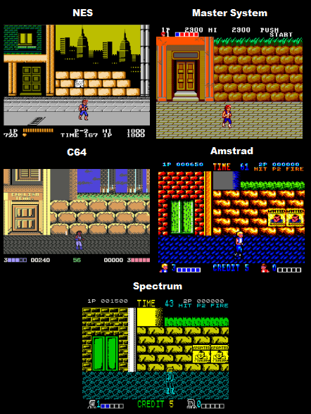
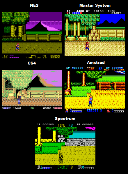
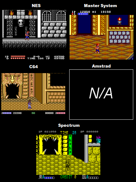
NES - The detail level is actually quite nice. The texture work is consistently good (check the road in the first screen shot, it has the main part of the road, with the sidewalk, and sewer gratings both apparent) little elements like signs and posters have been included, and often there are detailed far backgrounds visible (cityscapes, mountains etc). Master System - The detail level is fairly good, but definitely not on par with the NES version. The scale looks to be wrong (there's an appearance of walking through a giant environment), and quite a few liberties have been taken with the graphics (notice in the first screen shot instead of drawing in the original layered background the programmers just increased the height of the wall to block out the far distance). The texture work is decent, but not as good as in the NES version. There's also fewer small details in the graphics here (less posters, signs, windows, bins etc). The sprites are definitely a little bit more detailed here though compared to NES (and coloured far better, though more on that later). C64 - Its not actually that bad. Apart from the tiny, badly drawn sprite (who looks like Rick James for some reason), a fair amount of effort has been made to represent all the main visual elements of the arcade version. Detail isn't that high (there's not many little details like posters etc) and the textures could be better, but overall this version still looks decent. Amstrad - A pretty good attempt has been made to add some detail to the graphics, with posters, broken fences etc included, and everything textured reasonably well. It looks a little blocky, but for the Amstrad's low resolution colour mode this isn't bad at all, the character sprites are also a better size than in the other versions (except spectrum). Spectrum - Detail wise its still roughly on par with the other computer ports, but the Spectrum could've done a lot better than this, with its high resolution more elements like door signs, windows, posters and the like could've easily been included. I also dislike the floor textures as I don't think they convey the source material very well (just compare the weird looking blue road texture on the first screen shot to the NES version which is actually properly drawn as a road and pavement). The main character here is also a good size, though he looks strangely like a skeleton wearing a wig. |
||||
Winner is: NES
|
||||
Colour |
||||
NES - Generally the colour in this version is pretty good. Some of the sections could've had better fitting choices, and the sprites in the game contain noticeably few colours, but its never too bad. One thing I do want to add is that some of the art direction with the backgrounds and colour choices do look fairly commendable. Master System - This version has some really colourful backdrops, and the colour use whilst occasionally a little garish, is easily the best of all the ports (just check out that 2nd screen shot of the forest). The biggest difference in quality however is with the sprites, the sprites are leagues ahead of the other versions, containing much better colour use. C64 - The colour in this version looks a bit drab and washed out, its still decent, but not up to the console port standards. Amstrad - Actually pretty good here for the most part, it does look quite over the top (blue ground?) but overall it manages to still look pretty nice overall. Spectrum - Unfortunately, the sort of colour use you expect from the Spectrum really, its all very garish and ugly, but its not so bad as to make it too hard to see what's going on during gameplay. |
||||
Winner is: Master System |
||||
Animation
|
||||
NES - Its well drawn and the combos look good in motion, there's a good amount of frames and a good amount of actions, with the character doing roundhouse's, drop kicks and uppercuts. Master System - Overall its decent, but could've been a lot better. Some of the frames are fairly badly drawn and tend to look a bit unnatural in motion. The combo animation looks close to on par with the lowest experience level of NES (as you gain levels on the NES version you start to do more impressive combos like roundhouse kicks and uppercuts). The walking animation also looks a little cruder here than on the NES. C64 - Really, really awful. The jumping animation looks completely ridiculous in motion, and all of the actions only contain one frame of animation! (along with the standing frame). The standing up animation is completely absent, as is the weapon pick up animation, instead of picking weapons up they just appear in your hand automatically when you defeat an enemy! Amstrad - Pretty bad, whilst most actions are represented, drawn fairly well and contain 2 frames (on top of standing frame) the whole thing just moves way too slowly to simulate movement, the characters stutter along in slow motion and each frame is very obvious. Spectrum - Much better than the other computer ports, and surprisingly up to the standards of the console ports. Most actions are drawn fairly well and contain 2 frames each (on top of standing frame), the hair pull animation is included, along with a getting up animation, and there's also a walking-into-the-screen frame. Most importantly though in comparison to the Amstrad port everything moves much faster, just fast enough to keep the illusion of proper movement. |
||||
Winner Is: NES |
||||
Scrolling |
||||
NES - Pretty good, though its not quite as smooth and fast as the Master System version, the screen starts to scroll when you're closer to the edge which makes seeing what's ahead a little more difficult.. Master System - Faultless scrolling C64 - Like the Nes version this only starts scrolling when you get close to the edge of the screen, it scrolls fairly slow and sometimes takes time to catch up, overall its pretty decent though. Amstrad - Fairly bad scrolling, its extremely slow, and isn't very smooth (there's a very noticeable step). This, and the Spectrum version are also the worst for scrolling too close to the edge, you virtually have to touch the far right of the screen before it moves and because of this you cant see what's up ahead at all. Spectrum - Just about does the job. Its similar to the Amstrad port but is smoother and much faster. |
||||
Winner Is: Master System
|
||||
Sound |
||||
Music |
||||
NES - Sounds a bit wimpy in comparison to the arcade, but for the most part a good job has been done with the soundtrack as most of the songs are very melodic and catchy. The only thing I really dislike about the music in this port is the 3rd level tune, which starts off well but quickly becomes pretty dreadful. Master System - Also a little bit wimpy but not bad, certainly not as good as the NES version, though I do much prefer level three's music here compared to how it was on NES. C64 - There's no in-game music, only sound effects, though there is some pretty good between level jingles. Amstrad - Again there's no in-game music, only sound effects. Spectrum - Same as the other computer ports, no in-game music, only sound effects. |
||||
Winner Is: NES |
||||
Sound FX |
||||
NES - Pretty much standard NES sound effects really, they're not particularly realistic and lack impact, still decent though. Master System - The sound effects are fine, though nothing special. C64 - Actually pretty good, the punches sound strong with a proper impact, though the women sound a bit funny, and sound is a bit sparse for a game with no in-game music (could've had jumping sound effects maybe?). I think I'll call a win here, though to be honest there's very little to set the sound effects of any of the versions apart. Amstrad - Decent, nothing more, nothing less. Spectrum - Not that great, probably the worst of the five versions but they still do the job decently. |
||||
Winner Is: C64
|
||||
Gameplay |
||||
Double Dragon was one of the seminal beat-em-up games of its time. The game has you walking from left to right beating up thugs, with the occasional platforming gameplay thrown in (jumping on boxes or over gaps, climbing ladders or fences, dodging background dangers). The most interesting element though was the level of interactivity with the environments and characters, enemies could be beaten down and their weapons picked up and used against them, well placed attacks could send the thugs falling down holes or onto conveyers which would drag them off the side of the screen to their deaths. NES - For the most part the gameplay of the arcade original is represented fairly well (the combos work well, there are ladders to climb and opportunities to knock the enemies down holes), but a number of changes have been made. Instead of giving you all the moves available from the beginning the NES version of Double Dragon includes a new experience system where at the beginning you can only do the basic punch and kick moves, but as you defeat enemies you gain experience, and when enough experience is gained new moves are awarded. The new system isn't solely about making you work for your average arcade moves though, after you pass a certain level of experience you start to get new moves which have been created for this port, the new moves include the "Punch them when they're down" action from the original Renegade arcade game, and an overly elaborate combo where you finish by jumping up into the air for a final kick (this move can on occasion allow the enemies to counter-attack though). The experience system works fairly well and helps to keep the game interesting as you make your way through the levels. Apart from the experience system there is one other major difference to the NES version, Levels 3, and 4 have had many new sections added to them to increase the game's longevity, these new sections are actually pretty good, and contain much more platformer orientated sections (one part has you jumping along moving platforms). This version has a few bad points though, there's only ever two enemies on screen at once, the pacing is noticeably slower, and most damaging of all is the unfortunate lack of the two player option, which is a real shame. Master System - This version is extremely simplified in comparison to the arcade version, the ladders, fences, and conveyer belts are all absent, and the element of throwing the enemies down holes etc, is very much downplayed. The controls and hit detection in this version are dodgy, and not up to the standards of the NES port, the biggest damage in this area is based around the hair grab move, which is extremely temperamental to the stage that its no longer worth using. Due to the simplified gameplay this port is mainly just based around walking forwards and punching the enemies, then moving on and repeating until the end. The last criticism I have is the continue system, in this version you are actually awarded unlimited continues until the final stage which you have to complete with just one, this system means that you literally don't need to put any effort in until the last stage, no matter how well you play for the first three levels it will have no effect on your chances to complete the game. Onto the good points, this version is fairly fast and smooth, it has more enemies onscreen than the NES version, and, most importantly includes the two player option. Having another player along for the ride does help to lessen the repetitiveness of the experience, but unfortunately overall the gameplay still feels at lot less polished than the NES port. C64 - The gameplay in this version is atrocious. Most importantly half the moveset is missing (you can't even do a flying kick let alone a throw or hair grab!) and the stages are very empty (often only one enemy on screen). This version is pretty easy, even though punching and kicking here do not combo, you basically have to kick each enemy, then retreat, then kick, then retreat etc (which is extremely time consuming, not to mention boring). There is a two player option, but I wouldn't fancy anyone's chances of actually getting someone else to play this with them on 2-player. Amstrad - Again, the gameplay here is similarly awful, its actually ridiculously slow (and I mean ridiculously slow, its like you're moving in slow motion through the entire game), and very, very easy, the enemies take ages to kill but put up very little fight, making this version even more boring than the C64 version. On top of the previous problems, this port also has cut down levels with sections such as the moving rocks from the final level missing. There is a two player option, but it does little to save the game. Spectrum - This version is slightly better than the other two computer ports but is still very, very bad. Its slightly smoother and easier to do the moves but the enemies are far more aggressive and beat you down over and over, they punch you back consistently while you're attacking them, and, even worse can not only punch you when they're not lined up (which you can't do) but are actually programmed to purposefully move up to a position where they should be missing and pummel you without you being able to hit back (at which point you maneuver to hit them and they move again and go back to punching!!). These elements come together to make the Spectrum version extremely frustrating to play. |
||||
Winner is: NES |
||||
Presentation
|
||||
NES - The intro where your girlfriend is punched in the stomach and carried off is included, but the level transitions are not. Master System - Pretty much the same as the NES version. C64 - No intro, no between level transitions. Amstrad - No intro, no between level transitions. Spectrum - No intro, no between level transitions. |
||||
Winner is: Draw between NES and Master System |
||||
Misc |
||||
There's another C64 version by Ocean which seems to have been unreleased. The Nes port has an extra fighting mode, but its not really that great to be honest. There may have been another version released for the 128k Amstrad. I decided to go with the 464 version for this comparison as that's the version most people would've owned, and because I can't find evidence of the 128k version actually being officially released. Apparently the Japanese version of Double Dragon on the Master System has better sound quality due to the fact that it uses hardware removed from the western release versions of the console. |
||||
Conclusion |
||||
The computer versions are honestly the worst selection of ports of any arcade game in the history of gaming, they're the three stooges of game design, Ultra Slow (Amstrad) Ultra Frustrating (Spectrum) and Ultra Boring (C64) Between the two console versions popular opinion seems to usually go with the Master System version, which, to be quite frank is leagues behind the much better NES port. The only thing the Master System really has in its favour are its 2-player mode and better colour use, the actual gameplay suffers from a bunch of missing elements and the fighting doesn't feel as polished. The NES version is much longer, retains more of the arcade's features, and generally just plays better. So yeah you can play the Master System version 2-player, but what you get, whilst fun for awhile is simplified and a bit repetitive. |
||||
Overall Winner is: NES |
||||