Fantasy World Dizzy |
||||
Graphics |
||||
 |
||||
 |
||||
 |
||||
Detail
|
||||
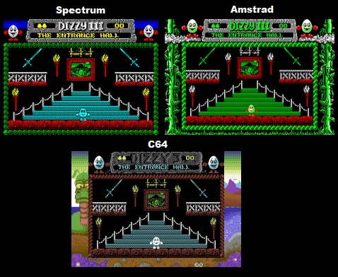
Spectrum - There's a pretty fair amount of detail in the foreground graphics, with everything (such as the rocks, banisters, and thatched roofs) quite well textured, but the backgrounds tend to be quite sparse with most of the screens having nothing but pitch black. Of special note are all the different characters, all well drawn and with a lot of charm, the only exclusion being Dizzy himself, who's sprite hasn't changed since the first game. Amstrad - The three versions re-use the same artwork, so generally all three of them have the exact same detail as each other. The only big difference here is a new beanstalk themed border, which is pretty well drawn but does cut down the size of the gameplay window a little. C64 - Like the other versions this too uses the exact same graphics for the gameplay area, with a new border added to the outside. The border here is very well drawn and looks very good, in fact, it actually kind of shows up the main graphics a little. One thing worth noting though is that the border partially cuts into the size of the gameplay window, meaning that on a real TV the Spectrum version actually has a larger viewing area than the other versions, which I think balances this section out as I'd rather have a big play area than a stationary border. |
||||
Winner is: Draw
|
||||
Colour |
||||
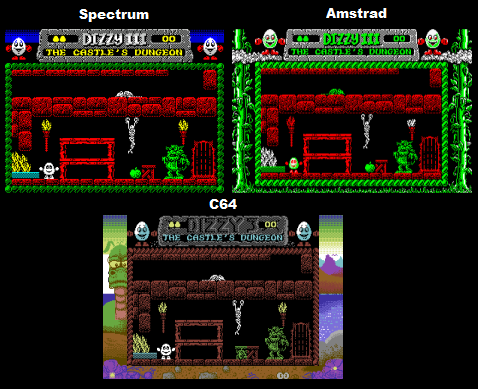
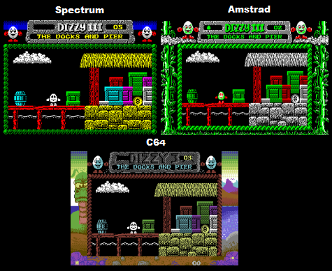
Spectrum - The colouring isn't really that great here, the use is a little on the garish side, and some of the choices are a bit off (the ever present red trees, wood, and rocks), but overall its just about decent, and colourful. Colour clash is there in spades, with Dizzy effectively changing to the colour of what's behind him at all times (see screenshot 1). Amstrad - This version has fewer colours than the other two versions (see screenshot 3), with the yellow colouring of keys, fire, thatched roofs, and coins replaced with white, and a lot of the other elements re-coloured green. This is primarily due to the Amstrad's hardware limitation of a maximum of 4 colours when using its high resolution mode. On the upside the main sprite is now better coloured, with red boxing gloves, and this is the only version completely bereft of issues surrounding the sprites as there's both no colour clash (Spectrum), and no transparency (C64) C64 - Colour counts and placing are all the same as the Spectrum version, but all of the colours have been swapped out for more fitting ones, with wood and rocks going from red to brown. A lot of the other colours have also been toned down, and aren't as garish as before. Its slightly duller, but overall I think its a notable improvement. The C64 version has much less colour clash than the Spectrum version, with the main character no longer clashing with the environment, but there's some minor elements which were masked on Spectrum, that now clash on C64 (see the apple in screenshot 2). Dizzy's sprite may not clash per se, but he still isn't completely solid either, as sections of detail (such as the eyes) are transparent and show the background (see screenshot 1). |
||||
Winner is: C64 |
||||
Animation
|
||||
Spectrum - Fantasy World Dizzy is well animated. Dizzy's walk looks good (as good as a walking egg is going to look), and his roll looks like it uses a good number of frames too, fire is animated and swaps between two different colours, and a few small elements (such as a crocodile on one of the screens) are also animated. Amstrad - Pretty much exactly the same as the Spectrum version C64 - Very similar to the other versions, but I did notice a few things, the fire is animated, but no longer flickers between colours, and the crocodile is no longer animated when you tie the rope around its mouth. |
||||
Winner Is: Draw between Spectrum and Amstrad |
||||
Scrolling |
||||
Fantasy World Dizzy is a flick screen game and therefore has no scrolling. |
||||
Winner Is: Draw
|
||||
Sound |
||||
Music |
||||
Spectrum - The song created for Fantasy World Dizzy has to be one of the least catchy soundtracks out of all the Dizzy games on Spectrum, it's respectable, but not really that memorable, and in my opinion it just doesn't live up to Codemasters' usual high standards in this area. Amstrad - The same as the Spectrum version, however here the music slows down in some of the more busy screens. C64 - Dizzy games tend to have a lot of variation between the songs used in the different versions, often the superior Commodore SID chip can be beaten out by a particularly well realised Spectrum/Amstrad melody... this is not one of those cases though as the Commodore music in this case pretty much obliterates the music used in the other versions. There's really not that much competition, the C64 simply uses a much catchier and more interesting in-game song. |
||||
Winner Is: C64 |
||||
Sound FX |
||||
Spectrum - The sound effects are actually really good here, I'd go as far as to say that Fantasy World Dizzy has the best sound effects of any of the Dizzy games on Spectrum, this is mainly due to it being the only one I can think of which uses the 128k chip for sound effects (the others use the beeper for sound effects). Of course this means that those with the 48k model would've had to have put up with no sound though. Apart from the in-game sound effects there's also a voice sample of someone saying "Fantasy World Dizzy" at the games title screen. Amstrad - Excellent, the same as the Spectrum version. C64 - This version has no sound effects, only music, there's also no voice sample at the title screen. |
||||
Winner Is: Draw between the Spectrum and Amstrad.
|
||||
Gameplay |
||||
Spectrum - For anyone not familiar with the Dizzy games you explore the environments talking to people, and navigating platforming sections whilst picking up different items and working out what to do with them to open up more of the map. The Spectrum version's smooth, responsive, and the menu's work very quickly. Amstrad - Pretty much the same as the Spectrum version, but there's quite a bit more slowdown in some screens unfortunately. C64 - Generally this is similar to the Spectrum version but with a slower pacing, the menu and item selection screen is also slower and more sluggish to navigate than it is in the other versions (especially when picking up too many items). One difference worth mentioning is that the timing in this version is off, everything here moves faster in regards to Dizzy, for example, there is a vulture in the "Guard House" screen which only attacks when its line of sight is not obscured by clouds, in the C64 version it moves three times faster! making this screen less about careful timing and more about practice and checking for danger areas, "The Snap Happy Gator" screen is also affected by the speed change. Lastly and perhaps most importantly, in the original versions of the game there is a section where you jump down a hole and fall into Australia, which, humourously is upside-down and reverses your controls. Unfortunately this has not been transfered here properly for some reason. When you reach Australia in the C64 version the screen is the correct way up but the controls are still reversed, kind of ruining the effect in a way that makes it seem like an unfortunate mistake has been made somewhere in the coding. |
||||
Winner is: Spectrum |
||||
Presentation
|
||||
The Spectrum version has an excellent picture of Treasure Island Dizzy which comes up on the stairs, this picture seems to be missing from the other ports. |
||||
Winner is: Spectrum |
||||
Misc |
||||
Not Applicable |
||||
Conclusion |
||||
Firstly, I'm quite surprised by the Amstrad version, from all accounts its supposed to be the lead platform but with the slowdown of its gameplay and music it actually feels the least polished of the three, the graphics also don't really use the Amstrad hardware to the fullest, and the environments here are very lacking in colour count. The only thing which stands out about this version is that the sprites are completely solid, and there's no clash. Out of the Spectrum and C64 versions. The C64 version has the better graphics and music, whilst the Spectrum version has the gameplay (and also of lessor importance the sound effects). Its a hard decision, but the loss of the upside down section is the real kicker here, it just about gives the win to the Spectrum. This was a memorable little section in the game and the error in the C64 version makes it feel a bit shoddy, you really can't call it the definitive version without it, regardless of the improved presentation. |
||||
Overall winner is: Spectrum |
||||