Zombies Ate my Neighbors |
||||
Graphics |
||||
 |
||||
 |
||||
 |
||||
Detail
|
||||
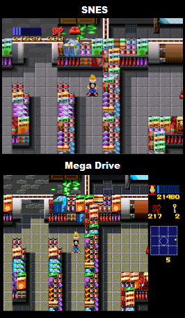
SNES - The graphical detail in Zombies is generally pretty good, of particular note are the character and enemy sprite designs which take inspiration from a variety of old horror movies, and all contain a lot of charm and character. The level artwork is well drawn, nicely detailed, and well textured. The one area where the graphics fall down a bit in is in variation, whilst there are a huge amount of levels there's not actually that many different environments, so some sections do start to look a bit samey after you get halfway through the game. Mega Drive - The first thing which is instantly noticeable here is that there's a huge, and very bland looking status bar. Originally in the SNES version pressing one of the shoulder buttons brought up a transparent radar, I would guess that being that the Mega Drive has no hardware transparencies, and fewer background layers, the developers had little choice but to move the radar out of the way to its own section (working to a deadline probably didn't help either). To fit in the new status bar this version has horizontally compacted the graphics, due to the compacted graphics the sprites of the main characters and monsters all look too thin (see sprite screen shot), and much of the levels look noticeably squashed. Another big difference here is in the detail present in the floor textures, here they all look much more crude (look carefully at the first screen shot, the floor tiles on SNES are properly textured, whereas on the Mega Drive they're little more than a mass of uniform dots). Overall the detail looks quite a bit worse here. |
||||
Winner is: SNES
|
||||
Colour |
||||
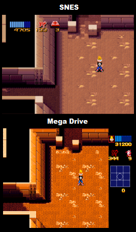
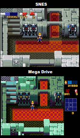
SNES - The colour use here is extremely good, and very professional in its use. The SNES hardware is well utilised as the colour counts are often quite high, and the actual colour choices are very carefully picked. Mega Drive - Where it comes to colour the Mega Drive hardware was not on par with the SNES, Nintendo's machine can not only display more colours onscreen simultaneously, but also has a bigger pallet of colours of which to choose from. Now, if a game was designed for the Mega Drive originally this is not too much of an issue, as the actual look of the game can be designed around the Mega Drive, and colours can be allocated as needed, but with games designed for another system first, like Zombies, there is more of a problem. Zombies Ate my Neighbours is a pretty good example of the differences in colour features between the two machines, as both colour count and pallet differences are clearly shown. If you look to the second screenshot down you can see that the SNES version has a very carefully chosen pallet, not only does the sand colour look quite fitting but the floor texture is also well blended, on Mega Drive the colour fits much less, and is more garish, on top of this the textures are also grainier due to there not being closer fitting colours which would blend well in the pallet. The third screenshot shows the other problem, in this screen shot the SNES version was displaying more colours than the Mega Drive hardware can show at one time, so the developers ended up changing the colour of the walls so that they could re-use that colour for elements of the floor. |
||||
Winner is: SNES |
||||
Animation
|
||||
SNES - Fairly good, though not really anything to write home about. Mega Drive - Pretty much the same as the SNES original |
||||
Winner Is: Draw |
||||
Scrolling |
||||
SNES - Perfect multi-directional scrolling Mega Drive - The same as the SNES |
||||
Winner Is: Draw
|
||||
Sound |
||||
Music |
||||
SNES - The music in this game is all very well done, its catchy, and of consistently high quality. The music tracks really do a great job of reflecting the campy horror source material, sounding kind of spooky but kitsch at the same time. Mega Drive - All in all a fairly good job has been made of transferring the original tunes. The success rate varies from track to track, and they're not quite as good as they could have been, but its certainly quite well done overall |
||||
Winner Is: SNES |
||||
Sound FX |
||||
SNES - The sound effects are extremely good here, there's quite a lot for there to represent all the different monsters, and they're all very high quality and well done. Mega Drive - The sound effects here are much lower quality and often sound quite abrasive, some sounds are cut down (this can even be heard as early as the player select screen), and some are just generally worse than they were originally (the midget axe murderers which used to have high pitched shouts now sound more like Al Pacino shouting "Woo Ha!"). Personally I see no reason for this degree of drop in quality, I've heard the Mega Drive do far more complicated sound FX in the past (Cool Spot, Earthworm Jim), and with much less distortion. For this reason I put the drop in quality down to more of a lack of experience with the hardware, or lack of effort on the part of the people who ported the game. |
||||
Winner Is: SNES
|
||||
Gameplay |
||||
SNES - Zombies Ate My Neighbours is a top-down shooter similar to old arcade games like Alien Syndrome. You basically move around levels shooting the enemies and rescuing people. Unlike Alien Syndrome the people here can be killed by the monsters if they reach them before you do, this factor leads more of an element of urgency to the proceedings. One of the more interesting aspects of Zombies is its focus on item management (a feature much touted as revolutionary in later horror games like Resident Evil). Sometimes ammo can be in short supply so its best to only use it when necessary, and you also need to take note of your supplies for each weapon as different weapons have different effectiveness against each monster (this follows horror movie rules so silverware is effective against werewolves, crucifix's against vampire etc). Mega Drive - For the most part Zombies plays pretty much identically on Mega Drive to the original SNES version, whilst ugly, the new sidebar with radar is slightly easier to use (it doesn't obscure the screen anymore) but does not represent any really notable improvement, and really doesn't offset the loss of screen area. Lastly the Mega Drive version is missing the flame thrower weapon, which is a little annoying, but doesn't effect the overall experience too strongly as that weapon is fairly rare. |
||||
Winner is: SNES |
||||
Presentation
|
||||
SNES - There's not really very much added presentation in Zombies, you basically just get a menu screen and a demo. Mega Drive - Pretty much the same as the SNES version. |
||||
Winner is: Draw |
||||
Misc |
||||
Not applicable |
||||
Conclusion |
||||
Until I put the two versions next to each other I never realised just how much of a gulf in graphics quality there was between them, with the Mega Drive looking much grainier and cruder. Apart from the graphics the Mega Drive version is pretty much worse than the SNES original in every aspect so overall this comparison is a clear win for the SNES. I wouldn't say that the Mega Drive version is a rush job per se, more that the game was so much developed around the SNES hardware that when porting over to MD a lot of unfortunate, hard to deal with problems surfaced, for the graphics to have been on par the Mega Drive version would've probably had to have had at least some level of re-designing, which would've been very time consuming. The sound though I do feel could've done with a lot more work, around this time Virgin Interactive were really getting a lot from the Mega Drive sound chip so I don't see any other reason for Lucasarts coming out with this low level of sound quality other than a lack of effort on their part. Lastly I feel that while the big status bar was probably a necessary evil (either that or they would've had to remove the radar entirely) they could've at least done something with it to make it a little better looking, there's only a few different environments in the game so I'm sure they could've made a few different artwork designs for the status bar which could change from level to level (zombie themed status bar, egyptian themed status bar) each one re-using that stage's particular colours. So yeah, the Mega Drive version is still a lot of fun and looks fairly decent but the SNES version is the way to go. |
||||
Overall winner is: SNES |
||||