Zynaps |
||||
Graphics |
||||
 |
||||
 |
||||
 |
||||
Detail
|
||||
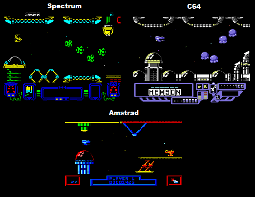
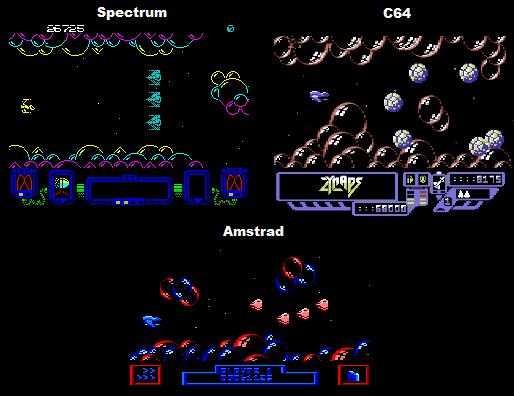
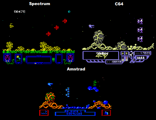
Spectrum - The game here is very nicely detailed, with this version is running in the highest resolution of the ports, the levels are interestingly designed for the most part, and there's a good amount of shading for many of the objects. There's a lot of repetition in the graphics (there are only really five different designs for the levels, with each design going through palette swaps from one stage to another), but there are a respectable amount of different elements to the graphics, and the levels use these constituent parts in different combinations to create the illusion of more variety. The game has many, many different enemy designs throughout, and they are all very well drawn, imaginative, and detailed. C64 - This version is running in a lower resolution than the Spectrum version, but many of the textures tend to have a little more detail (see the higher detail level on the flooring in screenshot 1), and there are a few more more elements placed in the levels. On top of those points though, the graphics in this version are generally a little more rounded, and less angular than in the Spectrum game (the bubble clusters feature a more organic, and less regimented placements for instance), and some sections look bigger, and more impressive (see the pods in screenshot 3 for example). The C64 game replaces the mountainous theme of one of the Spectrum's stages with a plant themed level (it looks kind of like lettuce to be honest). In my opinion both themes look equally good for different reasons, the new theme is more detailed and elaborate than the mountainous area was, but the mountainous area has a little more atmosphere. The sprites here have better shading, and look good, but I would say that many of them are a little lacking in imagination and variety in comparison to the Spectrum ones (a lot of the C64 enemy sprites look a bit uninspired, and samey). The stage bosses have a little bit of flickering here, which didn't happen on Spectrum, but a couple of the early bosses are bigger, and more impressive in this version (For some reason all of the later, bigger bosses are identical though). The last criticism for this version is that this game doesn't have a focus for its end boss battle, in the Spectrum game new enemies launched out of an organic looking orb, whilst here they just come from the screen edge. Amstrad - Generally this is the least detailed of the three, its the lowest resolution of them, has a smaller gameplay window, and often uses simpler, minimalist backgrounds of straight lines, and sparse objects. Like the C64 game some areas of this version have bigger, more impressive elements (again see screenshot 3), and there's better shaded sprites, but the game also has one less environment than the Spectrum/C64 versions, and this, when added to the other downgrades puts this version at the bottom of the detail section in my estimation. |
||||
Winner is: C64
|
||||
Colour |
||||
Spectrum - This game is very well designed for Spectrum, and is highly optimised, its definitely one of the neatest looking scrolling games on the system, and clash is actually fairly rare, and under control (the only clash there is, is situational). The colour use here is sectioned off into horizontal lines (see screenshot 2, the bubbles are coloured with a distinct line of purple, then a line of turquoise, then a line of yellow), which is fairly noticeable but is a requirement to keep clash down to a minimum, even so overall the art design is nicely done, and the game manages to be quite colourful. C64 - The colours used here tend to look a bit drab, but it suits the game's theme quite well anyway (its all technology, plants, and space, so grays, whites and pale yellows work pretty well). The colours aren't sectioned off like they were in the Spectrum game, and are placed completely independently, making the elements here tend to look more natural, and allows for better shading. Amstrad - The colour use here is definitely pretty good, there's a lot of variety, and the enemy sprites, and player ships are more colourful than they were in the Spectrum game, but against the C64 version the colours used look a little less fitting, and can be occasionally quite garish, the shading is definitely of lower quality too. On the upside the bosses are actually more colourful here than they were in either of the two other versions. |
||||
Winner is: C64 |
||||
Animation
|
||||
Spectrum - There's actually not really any animation here to speak of, the ships just slide across the screen without changing. Luckily, due to the spaceship theme this isn't actually that noticeable, and is certainly not a huge issue. C64 - All of the sprites in this version are properly animated, the player ship tilts back and forth as you veer, asteroids rotate through space, and the enemies have a selection of different actions. Amstrad - Much like the Spectrum version, there's not really any animation here at all. |
||||
Winner Is: C64 |
||||
Scrolling |
||||
Spectrum - Zynaps actually has very good scrolling, some of the most impressive for Spectrum, its very smooth. C64 - This also has very good scrolling, its pretty much faultless. Amstrad - The scrolling here is respectable, but it definitely doesn't look as smooth as the C64/Spectrum versions. |
||||
Winner Is: Draw between Spectrum and C64
|
||||
Sound |
||||
Music |
||||
Spectrum - Unfortunately there's no in-game music at all here, just a tune played during the menu screen. The Menu screen music is using the beeper, and is a little harsh, but for a beeper track its pretty good, and the programmers have definitely done a good job as its still fairly listenable. C64 - Like the Spectrum version there's no in-game music here, just menu music. The menu music here is actually very, very good. The tune used is very catchy, and memorable, and the quality of the sound is excellent. Another one of my personal favourite C64 music tracks. Amstrad - Again, like the other two versions there's no in-game music here either, just the menu screen tune. The menu music in this version is just as well done as it was in the other two versions, but I don't think the composition, or sound quality here quite stands up to the brilliant C64 tune. |
||||
Winner Is: C64 |
||||
Sound FX |
||||
Spectrum - The sound effects use the beeper. Overall they're actually fairly well done (under the circumstances), don't distract from the experience, and simply do a decent, and very respectable job. C64 - Very good sound effects, they're very high quality and sound respectably futuristic. Amstrad - The sound effects here are also pretty decent, I don't think its as well done as it could be (the sound that happens every time a power-up emerges is particularly harsh), but overall its a little better than the Spectrum game. |
||||
Winner Is: C64
|
||||
Gameplay |
||||
Spectrum - Zynaps is a scrolling shoot-em-up which plays in a similar manner to Gradius. The game is mainly focused on shooting the waves of alien craft, and powering up your spaceship with additional weapons. At the end of each level is a large end of level boss which needs to be defeated (or outlasted) to progress to the next stage. The power-up system in Zynaps is clearly inspired by Gradius, but its also been altered to work better with the 1-button controllers that were commonplace on 8-bit computers. If you collect a power-up the game cycles forward one position through a selection of different weapons in a set order, if you want to gain the currently highlighted weapon then you need to hold down the firebutton (causing the ship to glow) before you collect the next power-up. In order, the power-ups are - speed-up (increases movement speed, can be upgraded four times), shot (increases firing rate, can be upgraded four times), bomb (adds a bouncing bomb to your arsenal, can be upgraded twice), Homing missile (upgraded once, sends a homing rocket towards level bosses which does maximum damage), and seeker (upgraded once, if you hold the fire button down you fire out a homing bullet which follows enemies). Overall Spectrum Zynaps is actually a very surprisingly polished game which manages to retain a lot of the feel of popular arcade games of the time, has a well judged difficulty curve (mid level restarts, no cheap enemy placements), and interesting weapon upgrades (seeker is especially cool and rewarding, requiring a certain level of skill and practice to master). C64 - For the most part the main gameplay in this version is much like the Spectrum game with much more slowdown, but there are many small differences which occur throughout, and they add up to deviate the gameplay for the worse. Firstly, there are no mid level check-points in this version, if you die on a boss fight here then you're sent all the way back to the beginning of the stage. Secondly the controls have been changed, here your ship moves with inertia and momentum and is a little on the loose side, you tend to feel as though you have much less precise control here than in the Spectrum game. Lastly, all in all this version is just simply harder, the enemy bullets now aggressively home in on you, the bosses are more erratic, and the level layouts are more cramped too (leading to more unlucky, unavoidable deaths). The seeker missiles work differently in this version, they can be upgraded twice instead of once, and they fire off automatically, and repeatedly with little down-time (they leave the screen quickly, whilst in the Spectrum/Amstrad games they would hang around, and so needed to be aimed properly). I'm not sure how I feel about the new Seekers, they are fun to use, and are definitely impressive, but they also remove one element of tactic which was in the Spectrum title. Generally this version just doesn't feel anywhere near as polished in the gameplay department as the Spectrum did, its difficulty curve is all over the place (believe me enemy bullets following you + loose controls + slowdown is not a very good combination), and its generally just a much more frustrating experience overall. Amstrad - This version's collision detection is actually so poor that the game is literally impossible to complete (you need an extra 6 pixels of empty space below your craft to avoid collision, and the final stage has a gap that you have to fly through which has less than 6 pixels of space larger than your craft!). Really, after such a damning fact need I actually say more about the gameplay? OK, I'll carry on. Outside of the terrible collision detection (which not only makes the game impossible, but is also a constant source of annoyance, being especially problematic during all the bubble themed stages), this version is more cramped than the Spectrum game, and is misleading with its space on top of that too as the ship can't go all the way to the top of the gameplay window (because of this often you'll think you have the space to get above an oncoming hazard when you don't). Other than those issues there's much more slowdown here than in either of the other two ports. |
||||
Winner is: Spectrum |
||||
Presentation
|
||||
Spectrum - Nothing which hugely stands out, but there is a coding trick commonly referred to as rainbow processing for the between level briefing which allows the "prepare for combat" text to be written with more than 2 colours per 8x8 block. C64 - Again, not a lot of note, but there's a fairly nice raster effect for the main menu. Amstrad - This version attempts the C64 raster effect, and does a decent job of it. |
||||
Winner is: Draw |
||||
Misc |
||||
Not applicable |
||||
Conclusion |
||||
Obviously the Amstrad version is immediately out of the running, it should never have been released in the state it was. Out of the other two version, I have to say that this is one of the only occasions where the overall winner has actually lost virtually all of the rounds! yes, I have to go with the Spectrum version here simply because gameplay is king, and if the gameplay isn't quite up to scratch then the rest becomes fairly redundant. The C64 version is still fun for a play here and there, but the polish, and fair play just isn't there to sustain interest over prolonged gaming sessions. |
||||
Overall winner is: Spectrum |
||||